Advertising Formats Gallery
This page showcases example formats for monetizing conversational interfaces. Some of these are merely conceptual, some were already tested by our users. The world of opportunities is endless.
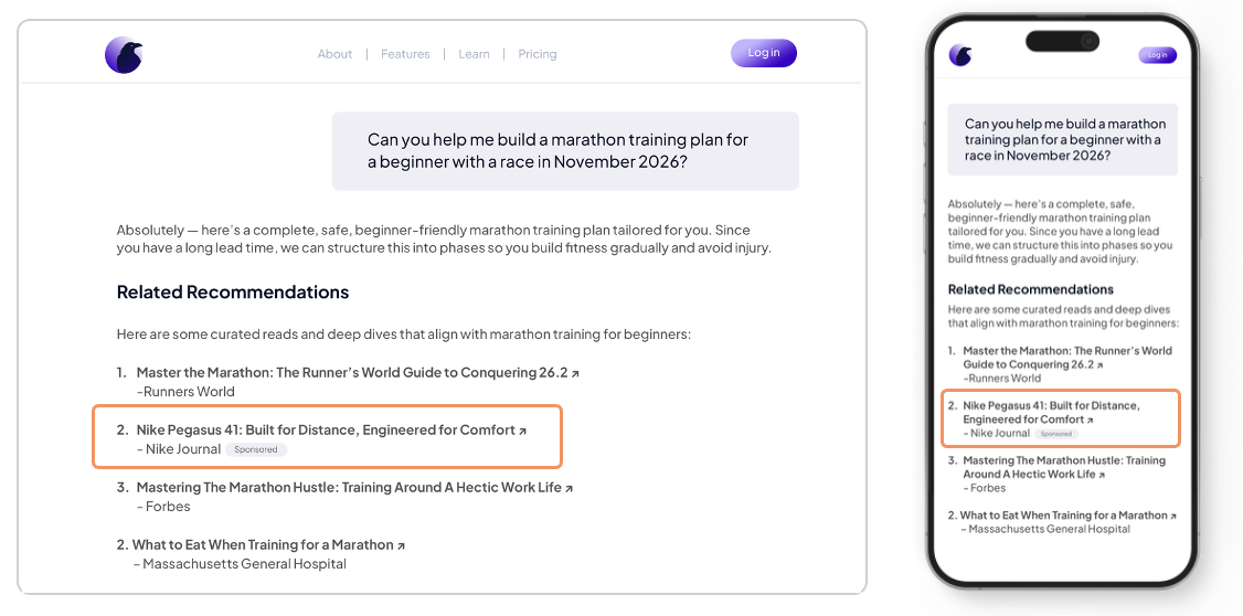
1) Contextual Recommendations
- Summary: Text list of similar or related articles.
- Screenshot:
- Recommended use cases:
- “How-to” moments, shopping guides, service comparisons.
- Placement guidelines:
- Between messages or as expandable card to preserve flow.
- Basic specs:
- Image, title, description.
- Measurement:
- Viewable impressions, clicks.
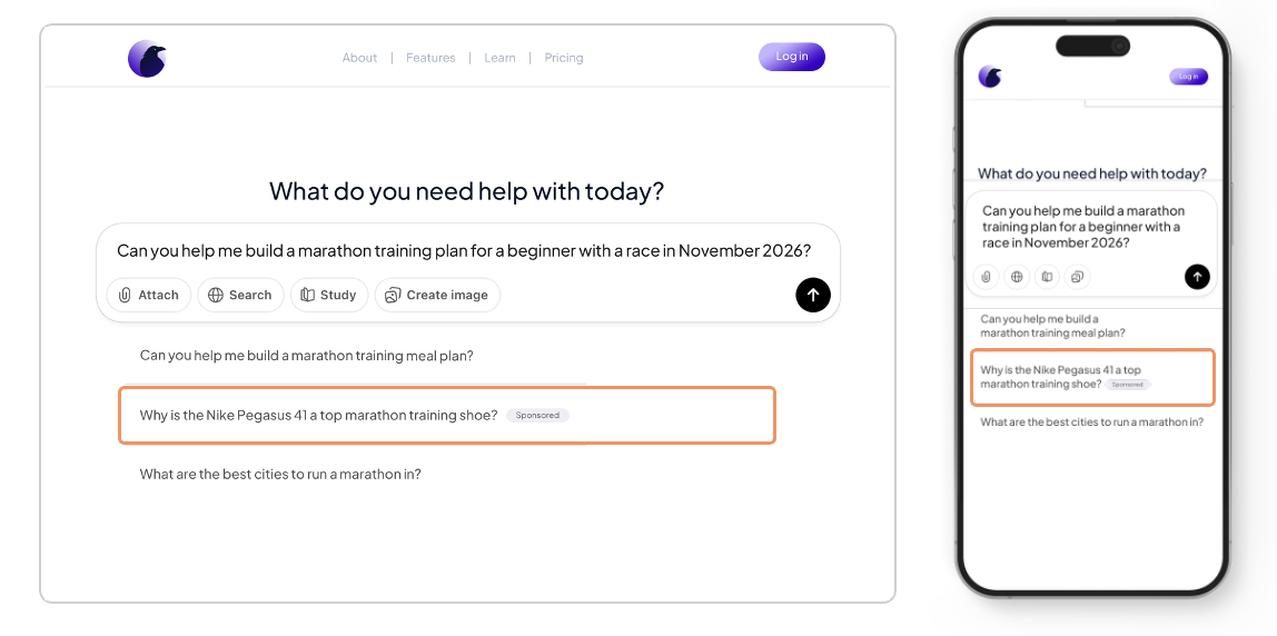
2) Sponsored Prompt
- Summary: Recommended initial question that user can select.
- Screenshot:
- Recommended use cases:
- Increase app engagement, extend conversation time
- Placement guidelines:
- Use granular contextual targeting.
- Basic specs:
- Label only
- Measurement:
- Actions, session duration.
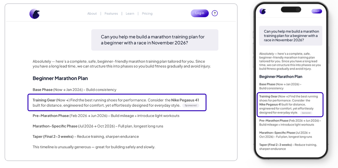
3) Sponsored response
- Summary: Sponsored quick-reply chip(s) that blend into the conversation flow.
- Screenshot:
- Recommended use cases:
- Drive action with 1–3 suggested replies tied to offers or trials.
- Placement guidelines:
- Present alongside organic suggestions; clearly labeled “Sponsored”.
- Basic specs:
- Up to 25 chars per chip; optional icon.
- Measurement:
- Chip impressions, selections, downstream conversions.
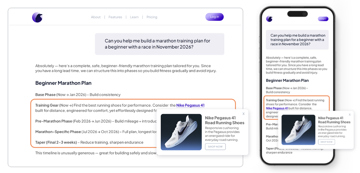
4) Intext Keyword Link
- Summary: Native message that appears inline within the conversation flow.
- Screenshot:
- Recommended use cases:
- Product discovery, promo highlights, contextual offers triggered by intent.
- Placement guidelines:
- Insert after assistant/user turns with high intent; avoid dense back-to-back ads.
- Basic specs:
- Title, body text, optional thumbnail, CTA.
- Measurement:
- Impressions, expands, link clicks, CTR.
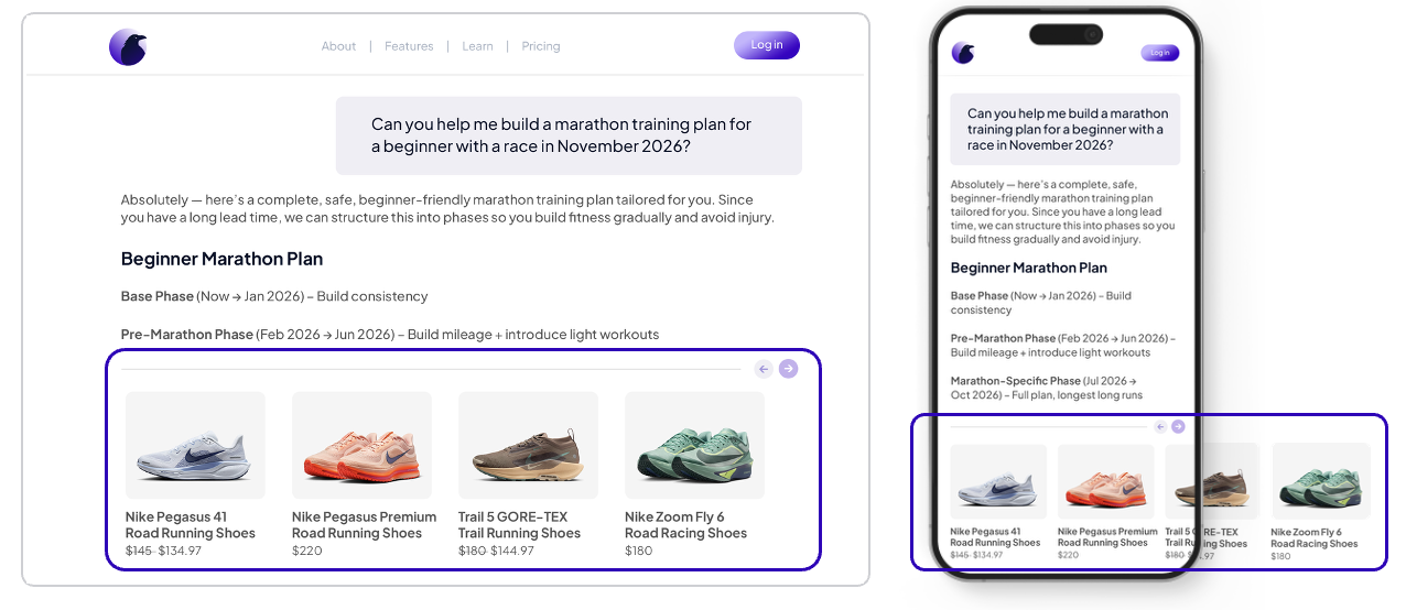
5) Product Carousel
- Summary: Horizontally scrollable set of sponsored items.
- Screenshot:
- Recommended use cases:
- Browsing multiple SKUs or offers in one unit.
- Placement guidelines:
- Use sparingly; ensure swipe/keyboard accessibility.
- Basic specs:
- 3–10 cards, image 1:1 or 4:5, title, price, CTA per card.
- Measurement:
- Card views, swipes, per-card clicks, dwell time.
Global Notes and Disclosures
- Sponsorship labels:
- Always include clear “Sponsored” or equivalent disclosures.
- Frequency capping:
- Set per-session and per-user caps to protect UX.
- Accessibility:
- Provide keyboard navigation, alt text, and ARIA labels.
- Privacy and consent:
- Respect user consent signals and regional regulations.
- Performance:
- Lazy-load assets; prefetch only when intent signals are strong.
Add, remove, or rename formats as needed to match your SDK build. Replace all image paths and code placeholders with your actual assets and integration snippets.